Tuna by Megu.
In a boost for Instagram dopamine hits, restaurant owners are branding their food and drinks. The seared tuna stamp isn’t too enticing, but the ice cubes are smart. Via Brand New.
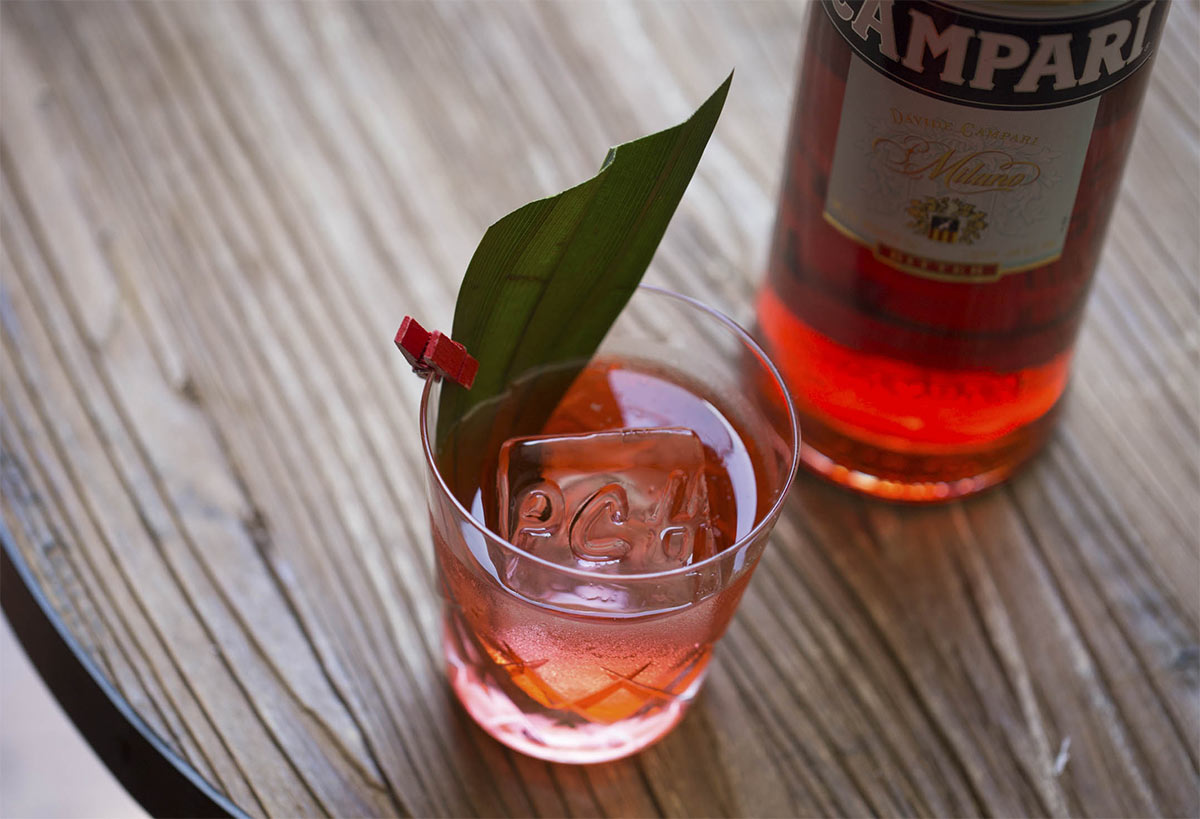 Ice by Pacific Cocktail Haven (PCH).
The most important quarter-inch in business, a great read, via Jerry Kuyper.
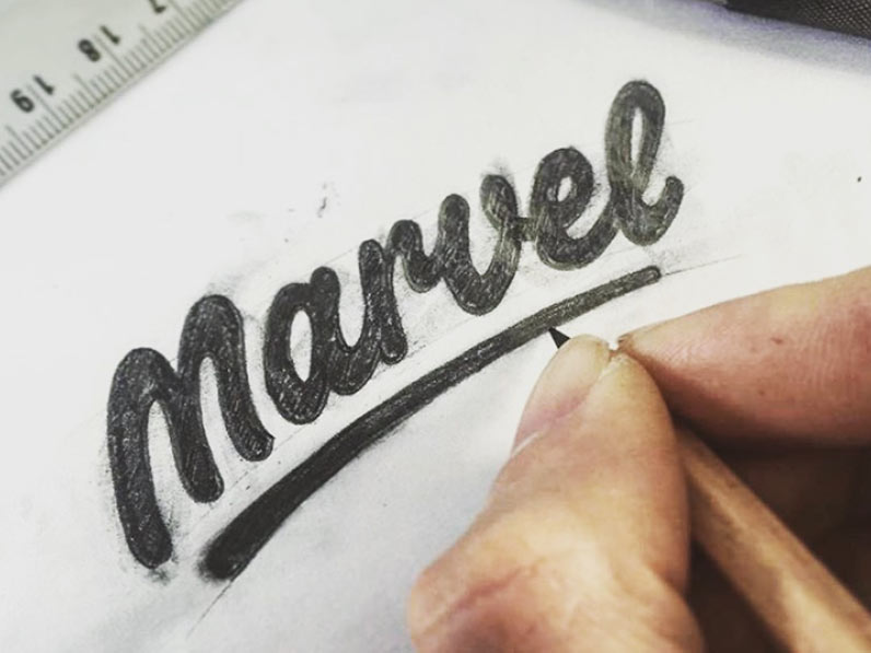
Paul Von Excite shared a nice look at the sketching process for his refinement of the Marvel App wordmark.

Behind the Facebook logo — a $100 million story. The designers were offered equity as payment, but decided against it. On the plus side, they weren’t short of work after the project was finished.
The Brand New Conference early-bird pricing ends next week for September’s event in Chicago. Another top lineup.
 Graphic by Stephen Hiltner, The New York Times.
A brief history of logo, via Khoi. The green T’s still my favourite iteration.
Not logo-specific, but there’s some design relevance in this maximum meaning, minimum means ethos:
“Abram Games used to describe his design philosophy as a combination of image and text that communicates an idea with ‘maximum meaning’ using ‘minimum means’.”
