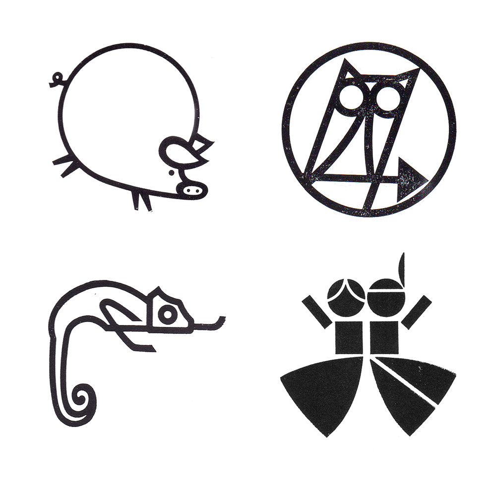
Some lovely Italian marks in the Archivio Grafica Italiana.
Officine Ranchetti logo, by Heinz Waibl, 1959.
Brian LaRossa shares the stories behind 20 publishing house logos.
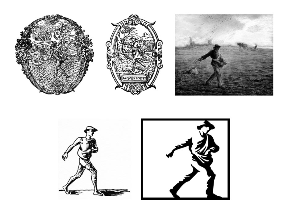
 Simon & Schuster logo evolution.
“Richard Simon and Lincoln Schuster stumbled upon “The Sower,” a painting by Jean François Millet, as they strolled through a gallery during their first week of publishing.

Vintage predecessors to contemporary company logos, on 99% Invisible. Related, from the archives (2008): When logos look alike.
Jerry West wishes it never got out that he’s the silhouette in the NBA logo. “I don’t like to do anything that calls attention to myself.” Via @TheLogoFactory.

Top marques — a collection of vintage French logos from the 50s and 60s. No credits, but nice.
And a good quote from Paula Scher on how design school doesn’t teach you what you get paid for.
“Mostly, designers get paid to negotiate the difficult terrain of individual egos, expectations, tastes, and aspirations of various individuals in an organisation or corporation, against business needs and constraints of the marketplace. […] Getting a large, diverse group of people to agree on a single new methodology for all of their corporate communications means the designer has to be a strategist, psychiatrist, diplomat, showman and even a Svengali. The complicated process, usually a series of endless presentations and refinements, persuasions and proofs, is worth money. That’s what clients pay for.”
What they don’t teach you in design school, in the CR archives.
