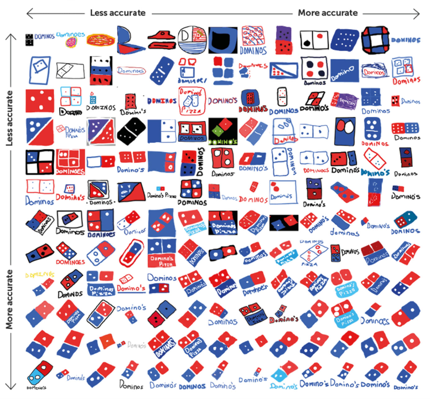
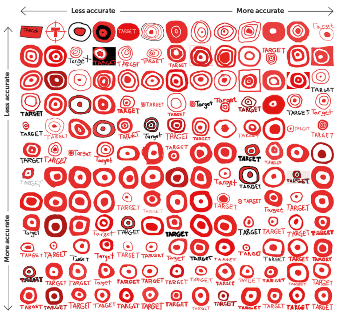
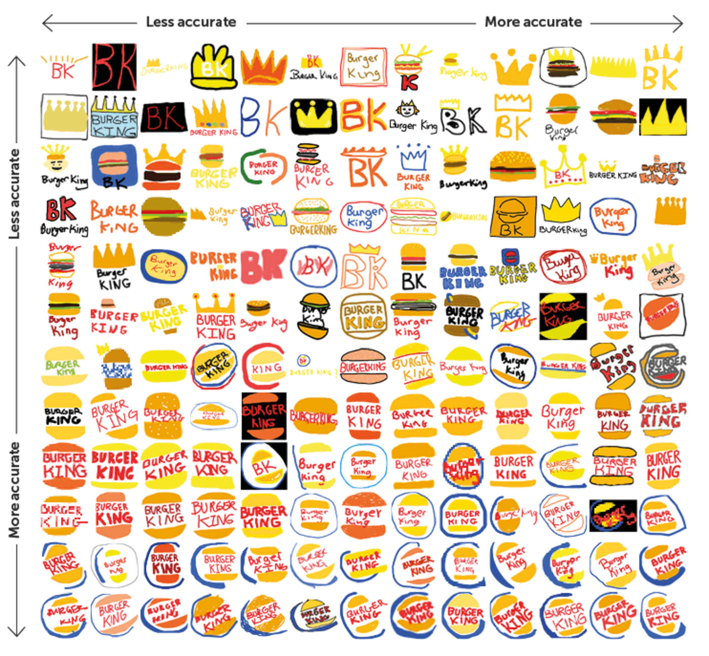
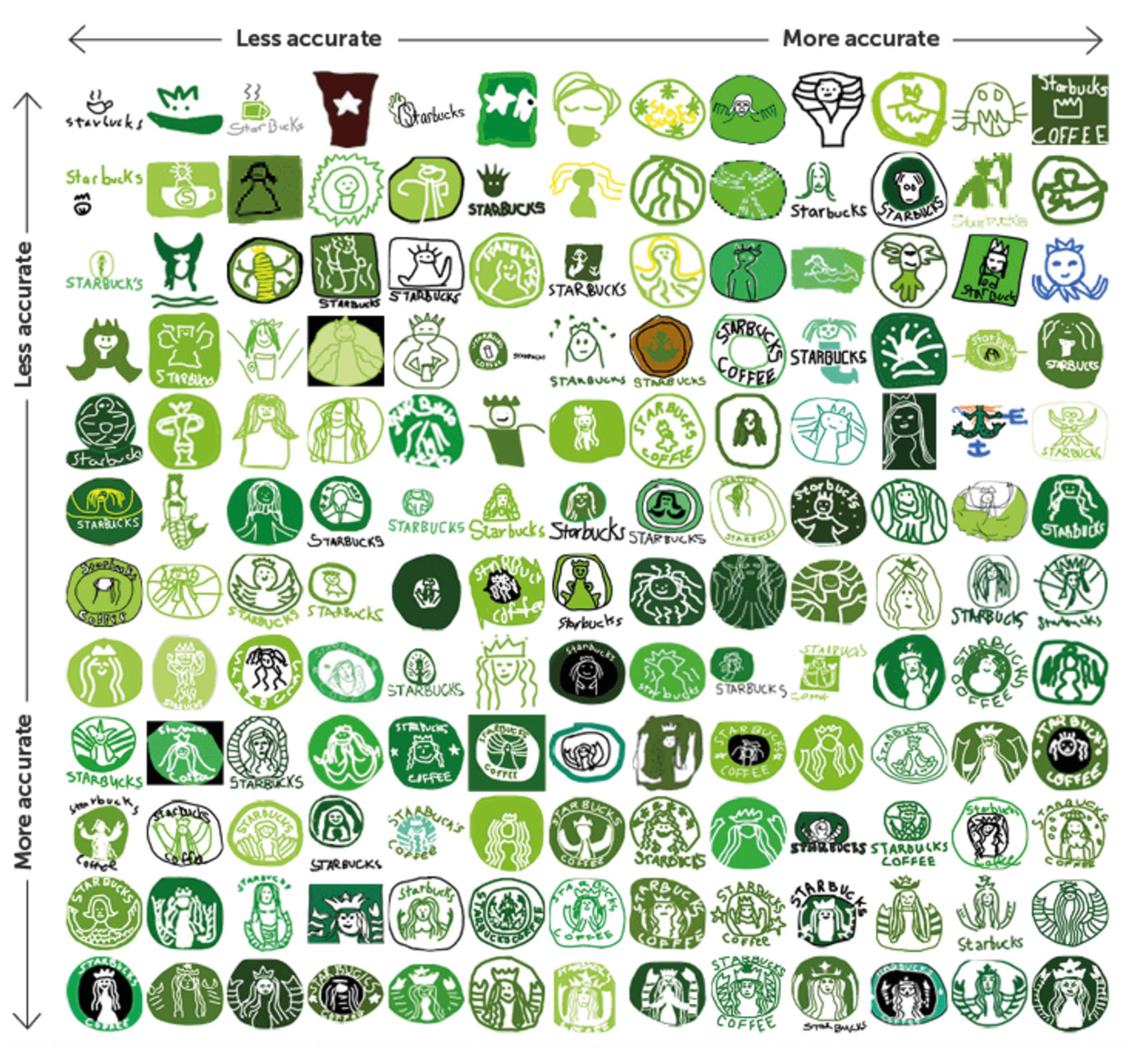
Top-left is least accurate, and bottom-right pretty much spot on.
The remainder are on Branded in Memory, from Signs.com.
Aside from the fact that there surely must’ve been a few graphic designers among the 156 participants, you’ll hardly be surprised that the logos with the most accurate recreations across the board, i.e., from top left to bottom right, are those with the simplest appearance (Target rather than Starbucks).
What’s obvious from the results is that most people are excellent at recalling brand colours — around 80 percent selected the correct palettes for their drawings, while shapes proved harder to recall. This highlights how beneficial it can be to assign logos with colours that are clearly different from competitors. Of course, it’s much easier to reach consensus on an unusual colour when working on a new design rather than something with existing brand equity (sometimes it’s more important to stick with what’s already in place).
While the study conducted was small, it kind of highlights the logo design challenge — to create a mark that can be easily remembered, while distinctive enough to stand out from the competition.
Via Debbie Millman.
