Moonpig logo, before and after.
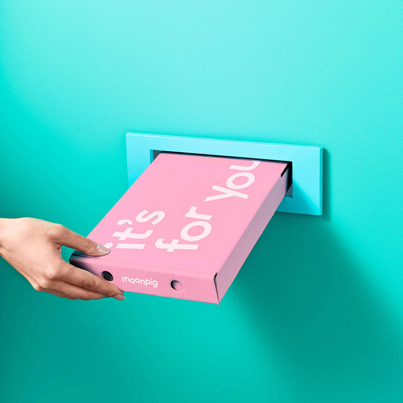
Personalised gift and greetings card retailer Moonpig was launched in 2000 by Nick Jenkins, who later sold the company for £120 million. The Jetson-like “space pig” mascot had been in place since the beginning, but it’s now been replaced by a more contemporary wordmark and identity.
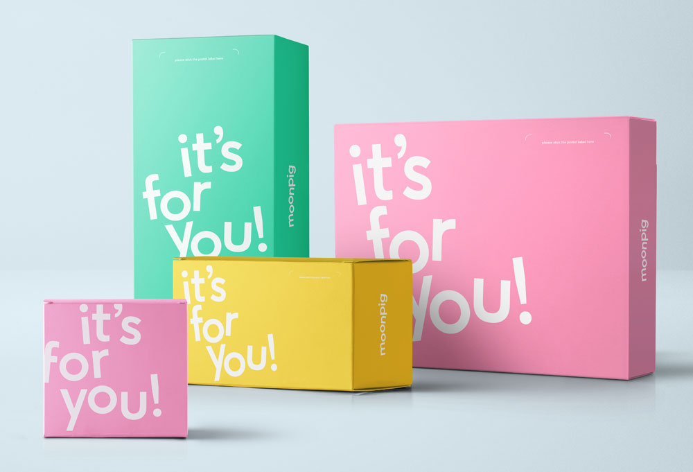
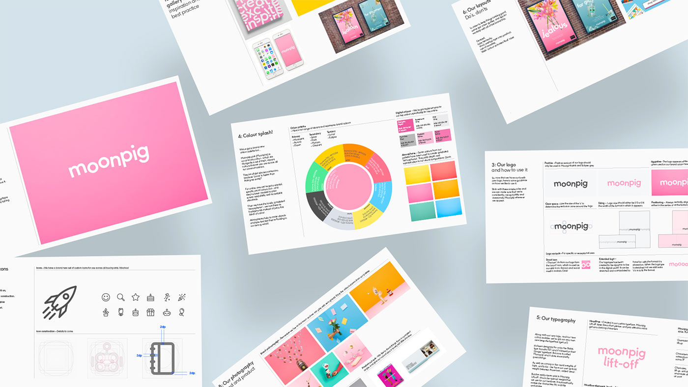
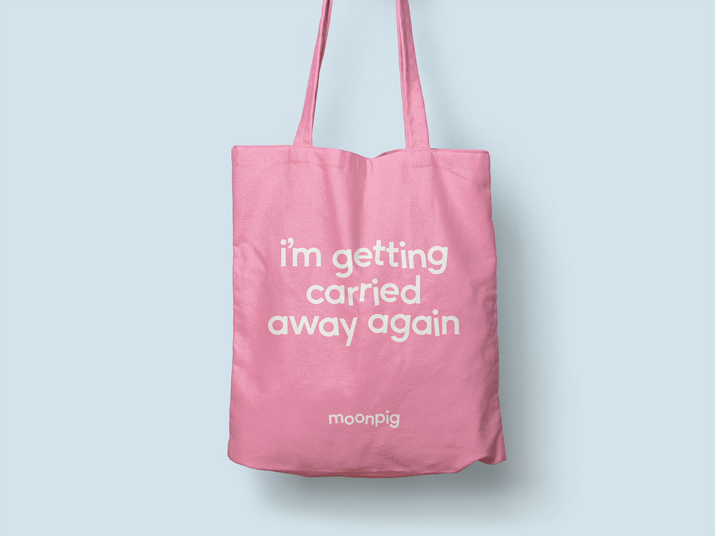
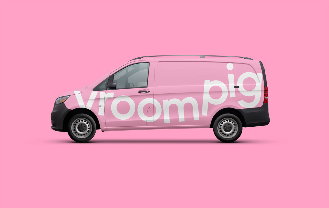
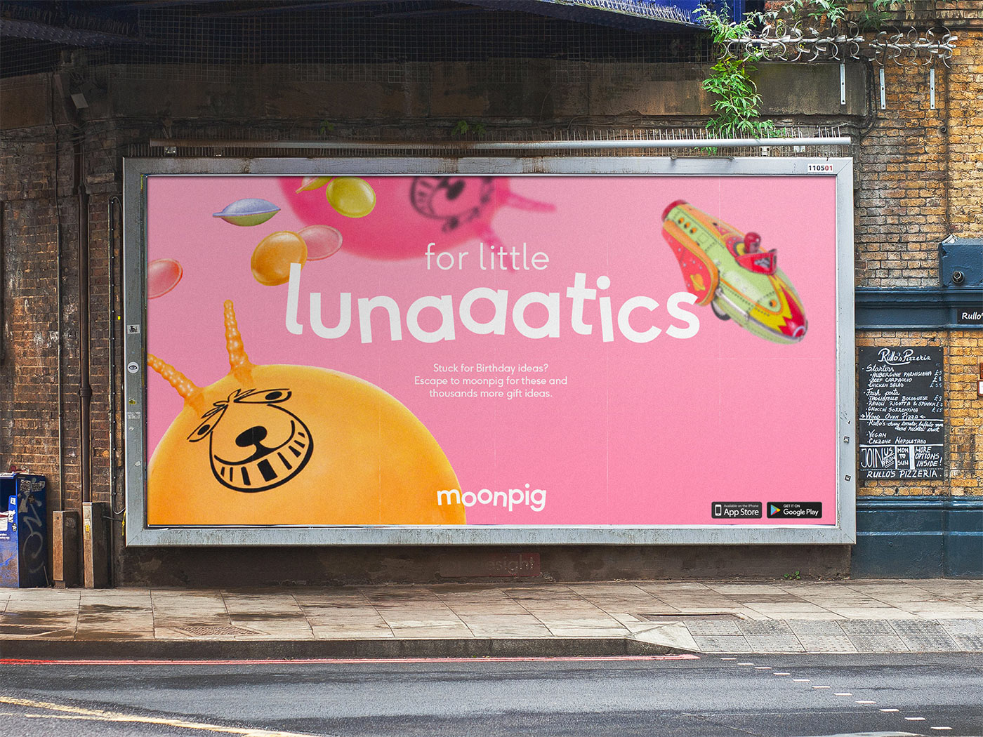
There’s a lot I like about the rebrand — the bespoke type design, the tone of voice, the snout icon, palette, even having a bit of fun with the logo launch.
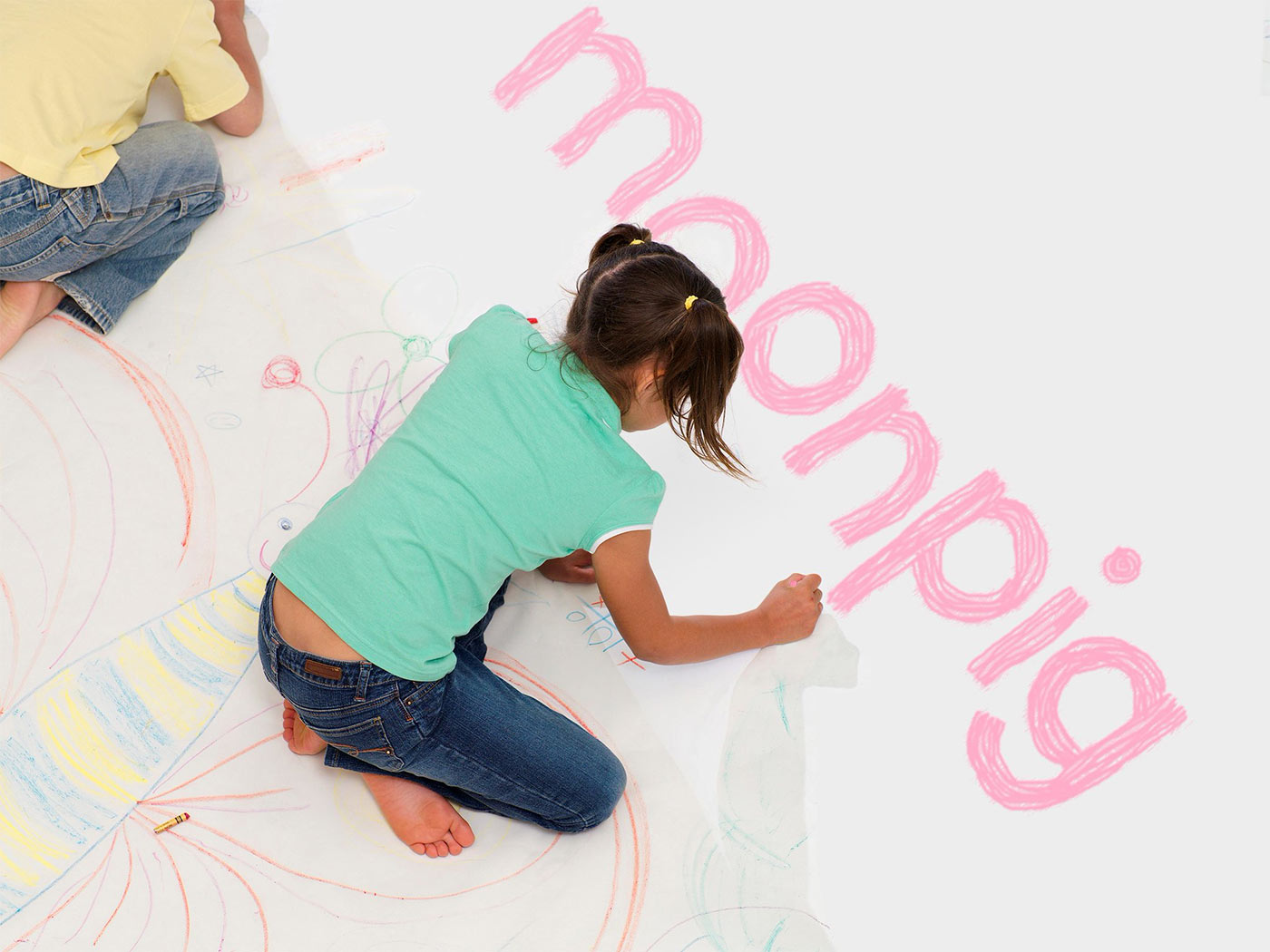 “‘My 6 year old could have done a better job of your new logo.’ Have you seen our new Creative Director?”
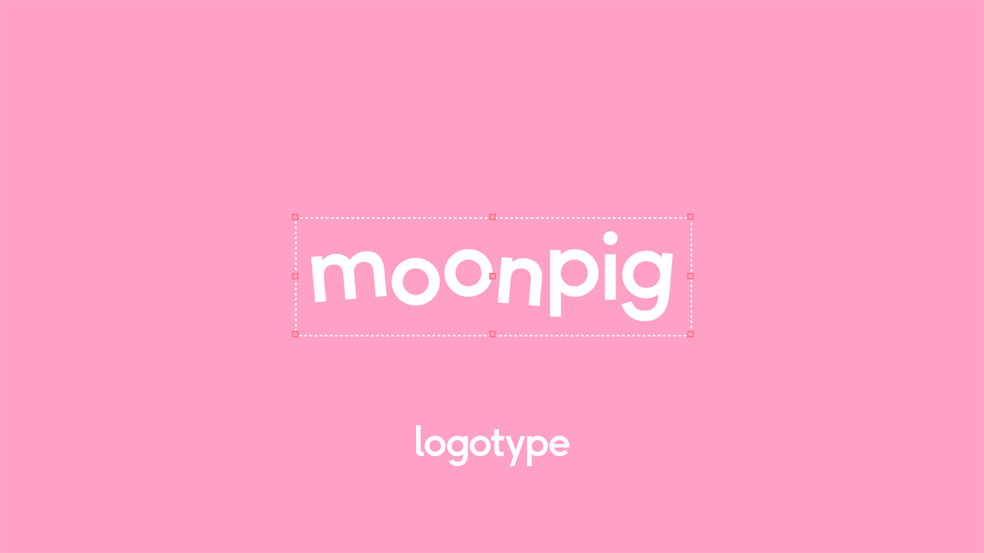
The identity was designed in-house in collaboration with Ian Styles, Simon Smith, Stuart Hammersley, and Rick Banks’ F37 Foundry.
“We worked extensively with British based type company F37 Foundry to create and develop a bespoke type family that would play a key role in Moonpig’s new brand identity. Both companies worked together using the F37 Ginger type family as the foundations, creating a new Demi weight called Moonpig Lift-Off.
“This weight features three styles of alternates with random programming, giving it a playful yet structured execution. It consists of four subclasses: a regular class for the normal design of the characters, one class for the ‘lift’ characters, another class for the ‘wobbly’ characters and one for the more complex group of characters — those that ‘shake’.”
Quoted from the Ian Styles project page.

Via It’s Nice That.
