The new Belfast logo, designed by local firm McCadden, was a recent topic on a radio phone-in after “a disgruntled council worker” shared a low-res version of the mark (below).
Unsurprisingly, public responses were typical of a logo presented in isolation, and the ran an equally typical tabloid-styled response.
Was new Belfast logo worth two-year wait and up to £50k of ratepayers’ cash?
Followed by this on the same day…
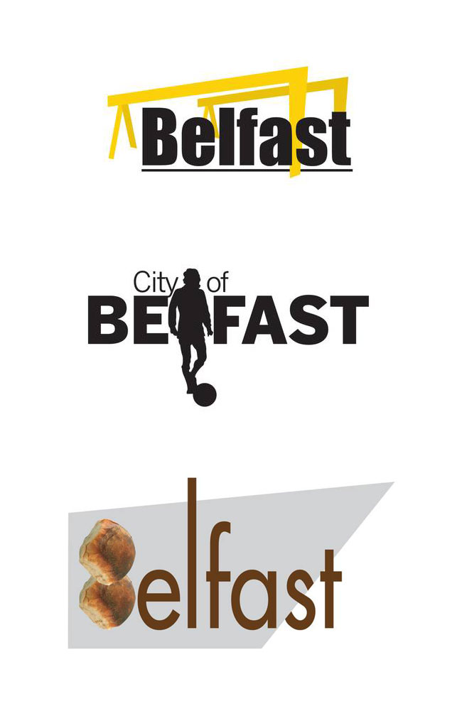
New Belfast logo: our graphic designer came up with these (for free) on his tea break. I’m not so sure of their “edgy and eclectic” nature (below).
A few days later, McCadden’s managing director Glenn Stewart said, unsurprisingly, it was disappointing that a single version of the logo was put into the public domain before a more informative launch could take place.
The design firm are billing around £45,000, with the fee including web work, brand guidelines, and a continuing advisory role over identity application — aspects that are often (conveniently) overlooked in media reports on new logos.
McCadden’s Glenn Stewart said, “I can genuinely tell you that in terms of how we would bill ourselves out, we have gone well over budget. We can’t charge for all the time we have spent on it. It’s not a big money spinner for us, but we are just so proud to be doing it. In our business it doesn’t get much better than branding your own city.”
The Belfast “starburst” takes its shape from how the city appears on satellite images, although some angles are a bit of a land-grab (and the Titanic Quarter has been cut from the top-right in reference to the city origins when that area was wetland).

And there’s the “logo as window” approach that often helps to persuade clients (in the clip below).
The real deal behind Belfast’s new ‘energising’ branding https://t.co/oFhojeYhk5pic.twitter.com/AlCxoUV4PE
— Slugger O’Toole (@SluggerOToole) September 19, 2017
Video via Slugger O’Toole.
Variety of colour makes sense, so it can adopt the palettes of other organisations the mark will sit alongside.
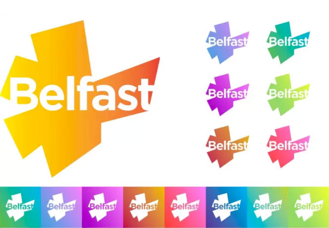
And secondary versions with “Belfast” shown in Irish and Ulster Scots were created.
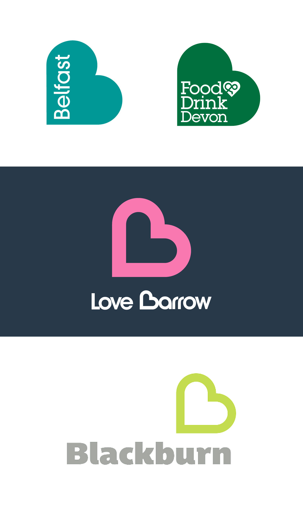
Belfast’s outgoing logo, designed in 2008 by Lloyd Northover, was a heart-shaped B idea that’s similar to a number of UK-based entities, so I can understand the decision to set a new brief.
City branding will never escape criticism as it’s generally paid for with the public purse, but while it’ll divide opinion, the new design’s certainly more distinctive than the heart, and reportedly much less expensive.
I’m sure it was no mean feat for McCadden to achieve consensus among council members, especially considering what happened before the previous Belfast logo was released.
